M&S Hospitality
A coffee brand with a shot of inspiration
The challenge: When M&S decided to introduce Magic Coffee, Melbourne's celebrated coffee style poised to be "the next flat white", to the UK market, we faced two hurdles. First, awareness of Magic Coffee was limited to serious coffee enthusiasts, leaving potential customers unfamiliar with this unique beverage. Second, our primary canvas – the branded sleeve for M&S coffee cups – offered minimal space to both explain the product and establish a distinctive identity that would capture attention and drive trial.


Our approach: Brewing mystery with desire
1. Coffee culture translation
We immersed ourselves in Melbourne's renowned coffee scene to understand what made Magic Coffee special, distilling its unique characteristics into messaging that would resonate with unfamiliar British consumers.
2. Typographic storytelling
We developed a visual language that would communicate the sophisticated yet accessible nature of Magic Coffee through carefully selected typography that would make maximum impact in minimal space.
3. Strategic launch sequence
We crafted a phased introduction that built anticipation before the full reveal, creating a sequence that would generate curiosity and position Magic Coffee as something extraordinary within the M&S café offering


The solution:
Frozen, reinvented
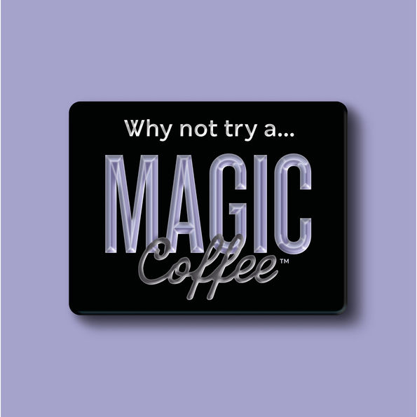
Distinctive dual typography: Designed a standout logo that wove together two contrasting typefaces: a strong, condensed font for impact and visibility, paired with a flowing script that evoked authentic coffee culture and craftsmanship.
Compelling colour palette: Employed a rich, dramatic colour scheme that distinguished Magic Coffee from standard café offerings, using deep tones that suggested premium quality while maintaining strong visibility on cup sleeves.
Evocative iconography: Developed subtle supporting graphical elements that hinted at the magical experience within, creating a visual shorthand that worked effectively even in limited space.
Concise sensory messaging: Distilled the unique taste and texture of Magic Coffee into the tantalizing tagline: "Silky. Smooth. Perfectly balanced." – allowing consumers to instantly understand what made this drink special.
In-store navigation: Simplified way-finding and product organisation made the stores more intuitive and enjoyable to shop.
Atmospheric art direction: Created mysterious visuals by shooting the coffee against velvet backdrops shrouded in shadow, conjuring an aura of intrigue and exclusivity.
Integrated launch materials: Developed a comprehensive suite of point-of-sale materials and social media activation ideas that maintained consistent visual language while expanding the story across multiple touchpoints.


The results:
One year after launch, M&S Magic Coffee sold more than 1 million cups, significantly exceeding sales targets and establishing itself as a distinctive offering within the competitive UK coffee market. It’s continued to perform strongly and become a hero product for M&S that’s loved by colleagues and customers alike.


"I loved working on this project. It was a departure for us, but I felt we had really strong ideas, right from the get-go. There was a real buzz in the studio when we were working on this – everyone wanted to be involved."
Ashley Hodge, Design Director, Whippet

